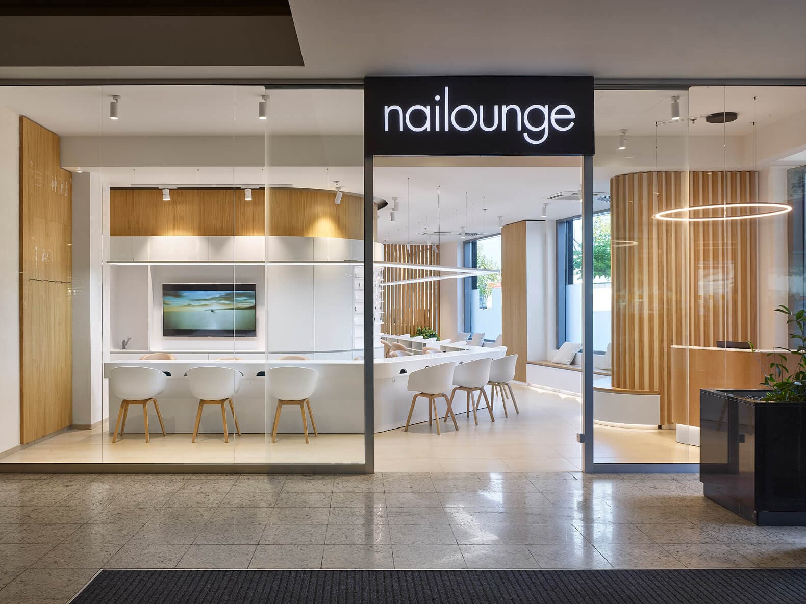
Nailounge
In shopping centers, we carefully select forms and lighting to ensure both functionality and a pleasing sensory experience
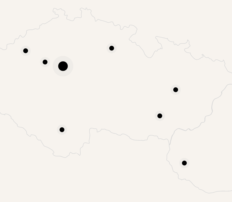
16 branches/Czechia & Slovakia/from 2013
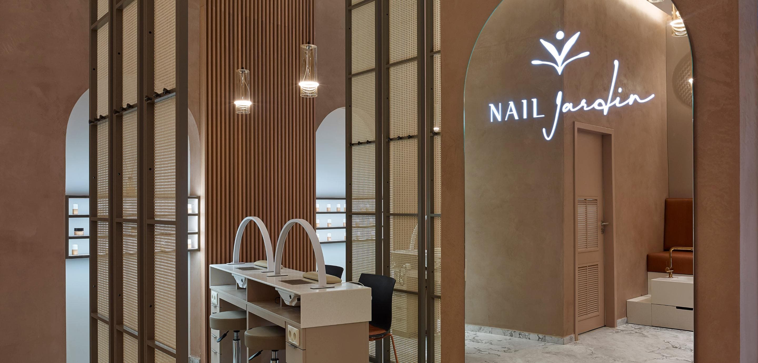
Care in Every Detail
What began as a kiosk has blossomed into a network of spaces, each designed to stir emotion. Our goal was always to create environments that resonate — places that stay with you. To do so, we engaged deeply with market insights, marketing studies, and brand storytelling.
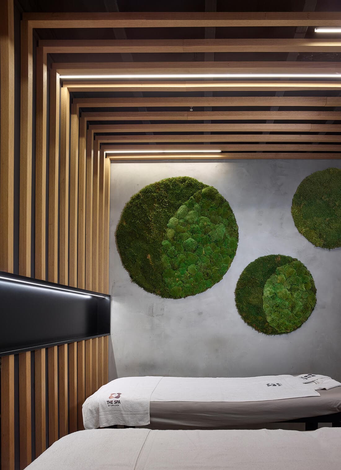
These shaped our designs, helping us craft spaces that feel both welcoming and distinct. Wood and white became the threads that tie the spaces together — symbols of purity and simplicity. Yet no two locations are alike. Each tells its own story, with unique partitions, materials, and living areas that offer a fresh expression while honoring a shared aesthetic.
Source: TV ARCHITECT
Inspiration
It all started with a kiosk, which we made appear to float in the space. Its shape is inspired by the form of an airship.
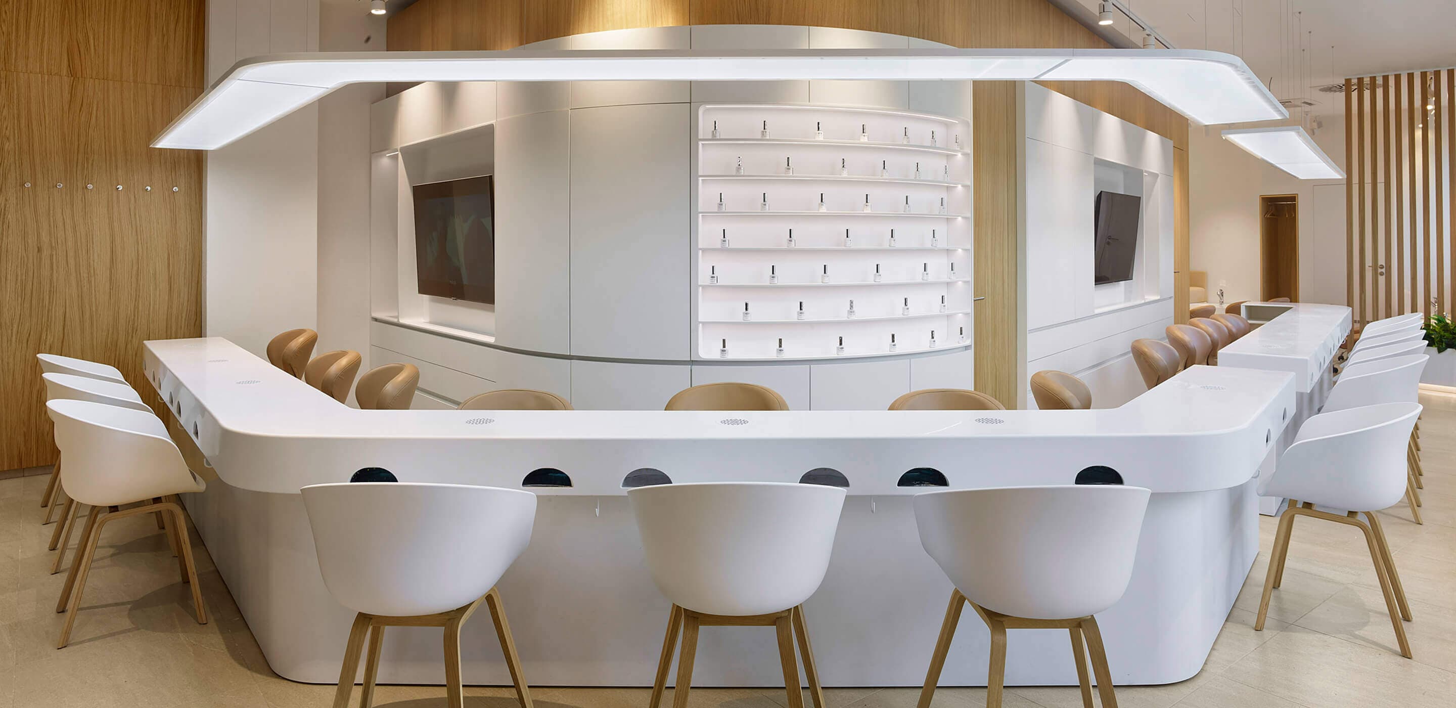
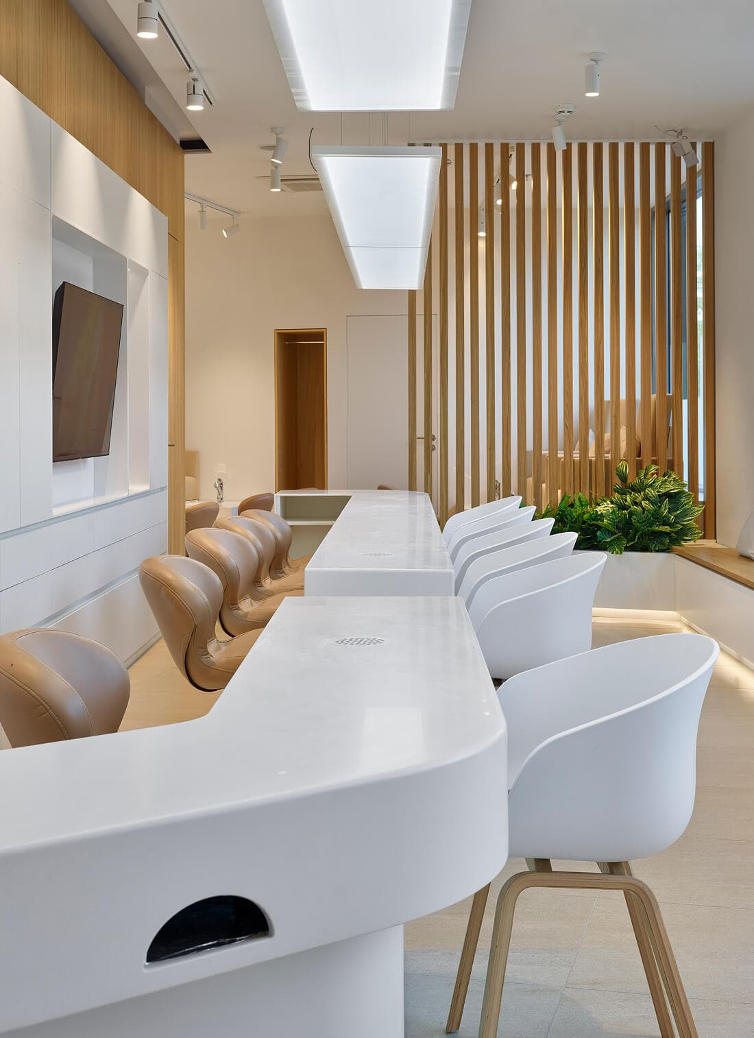
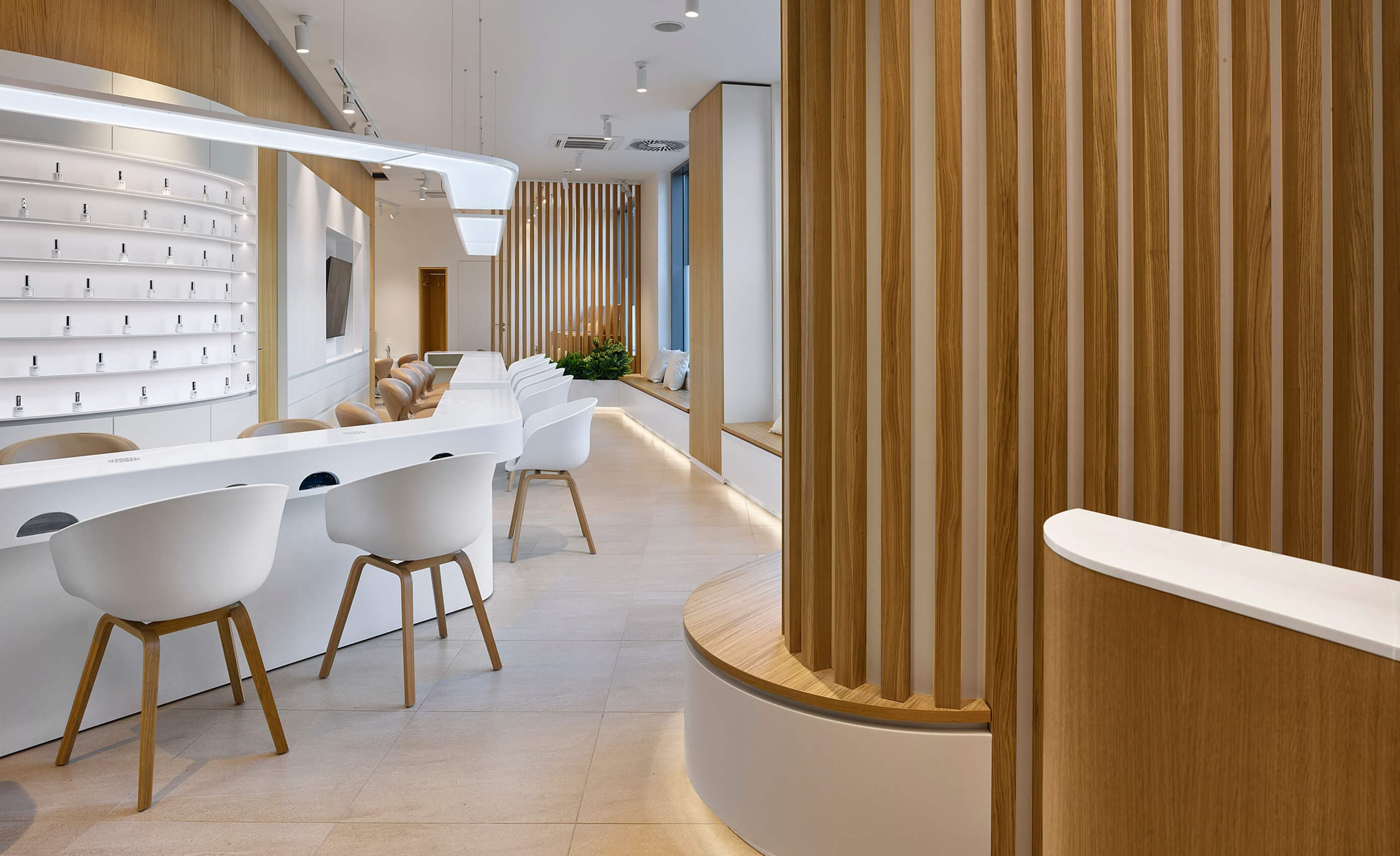
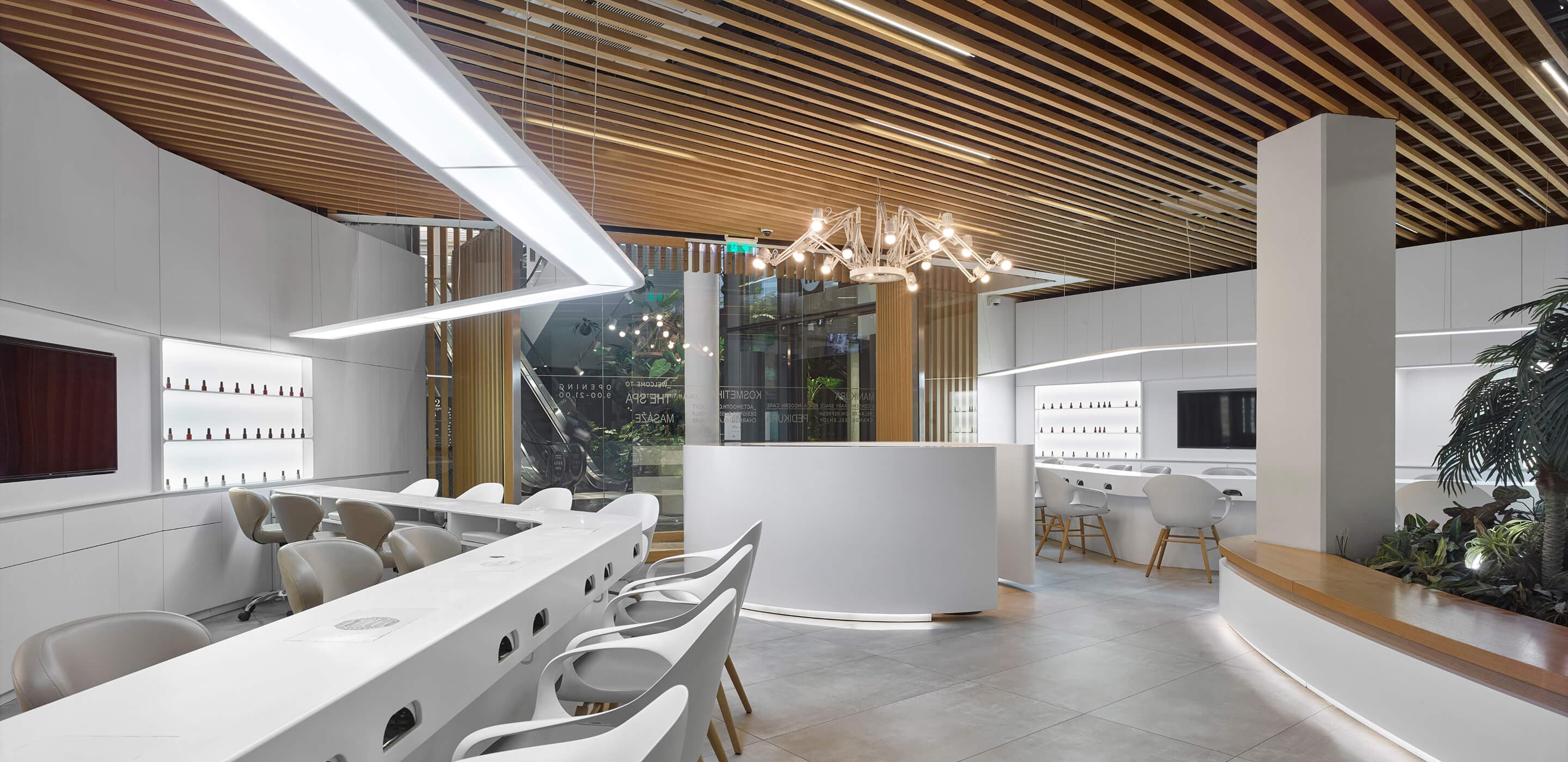
Signature Style
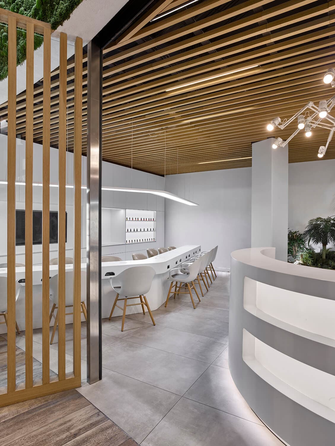
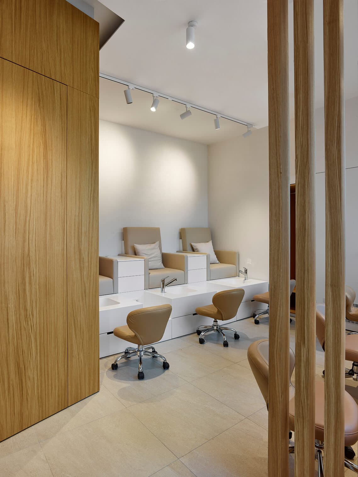
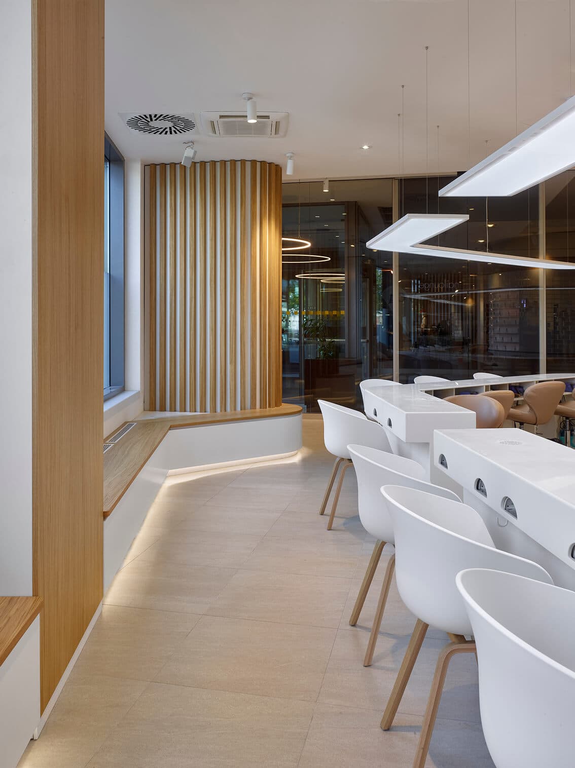
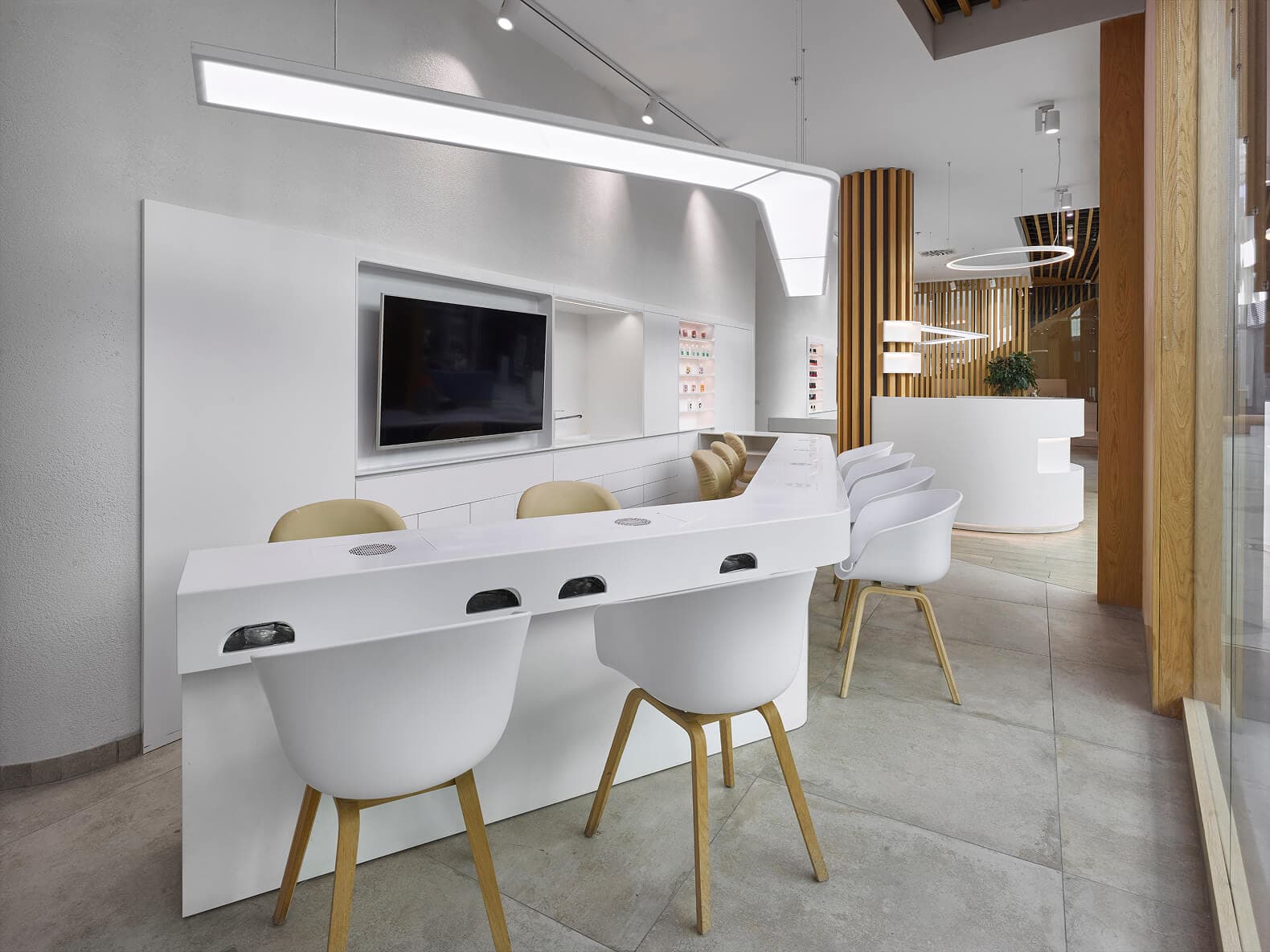
Wooden paneling, lightweight chairs, durable table surfaces, and abundant glazing respond to the need for a flexible space that will age beautifully.
To the Detail
To the Detail
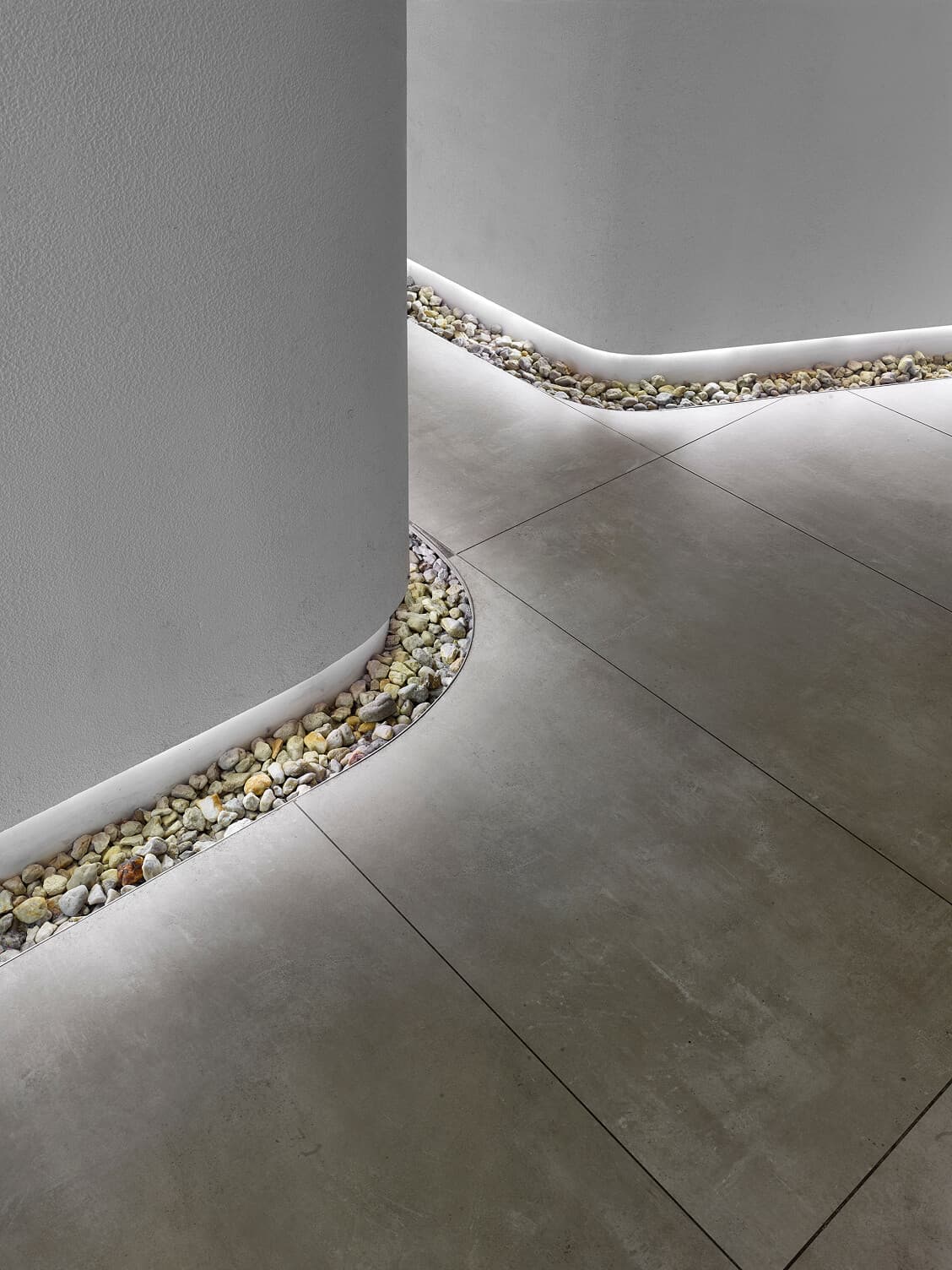
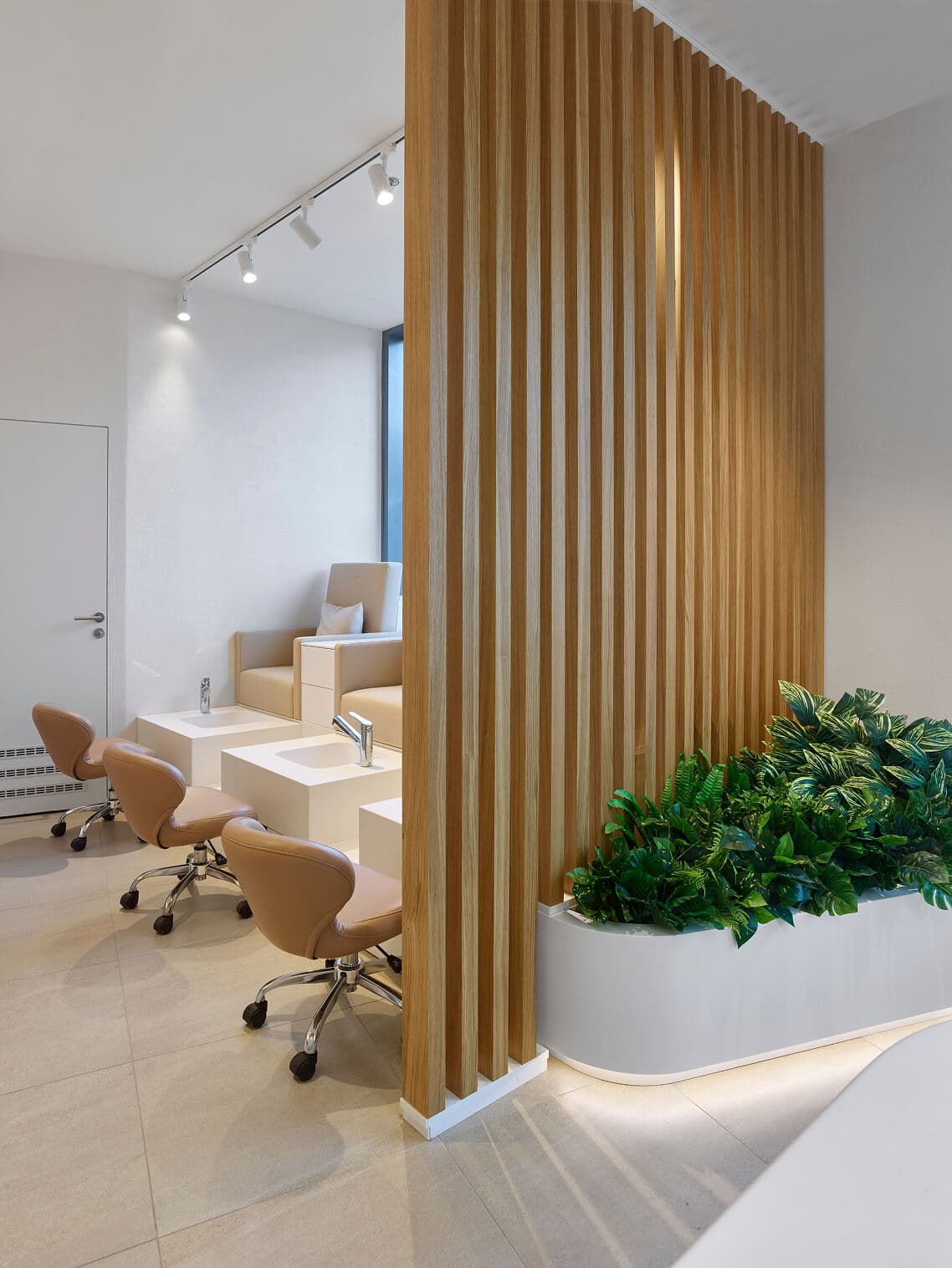
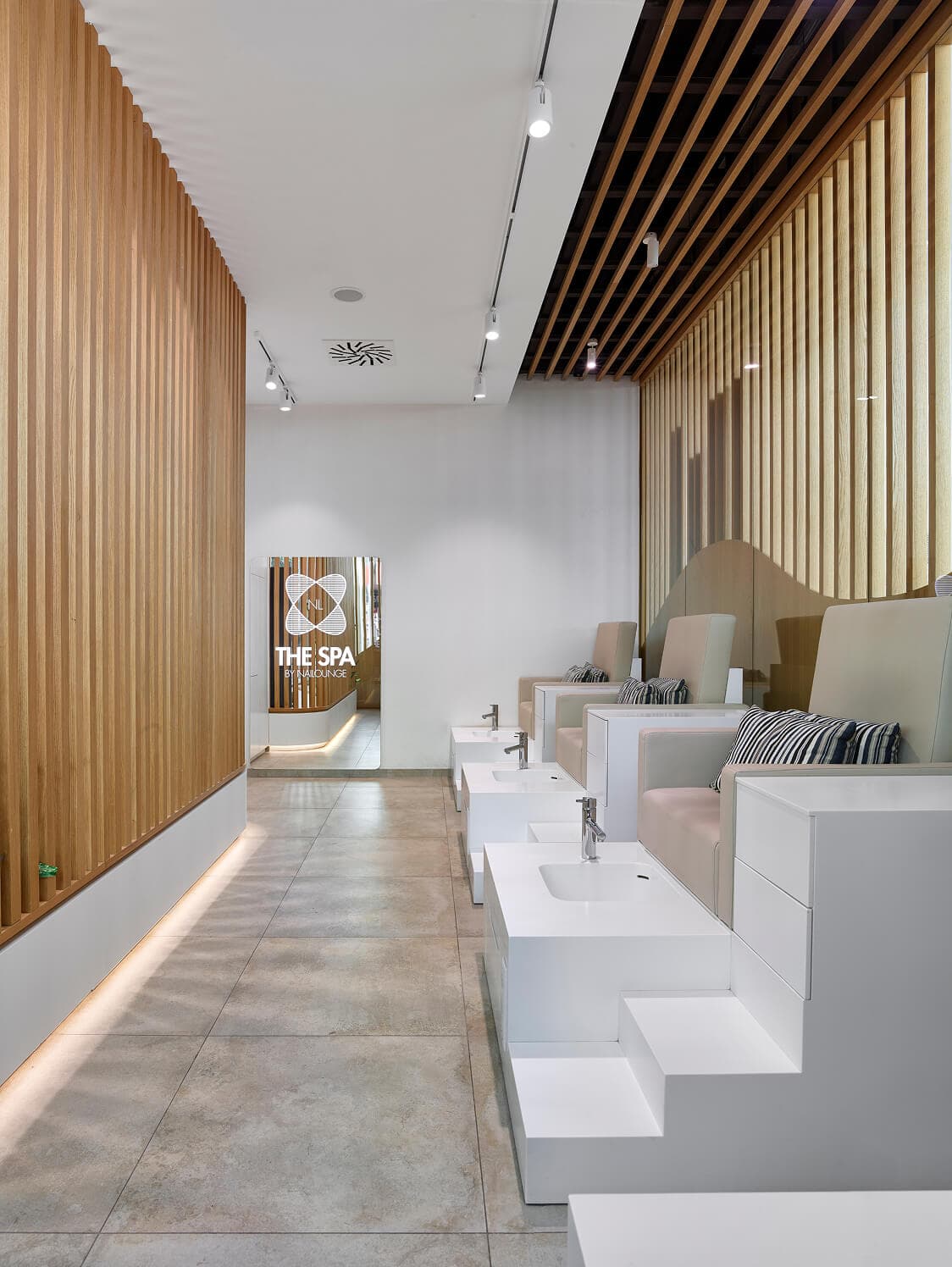
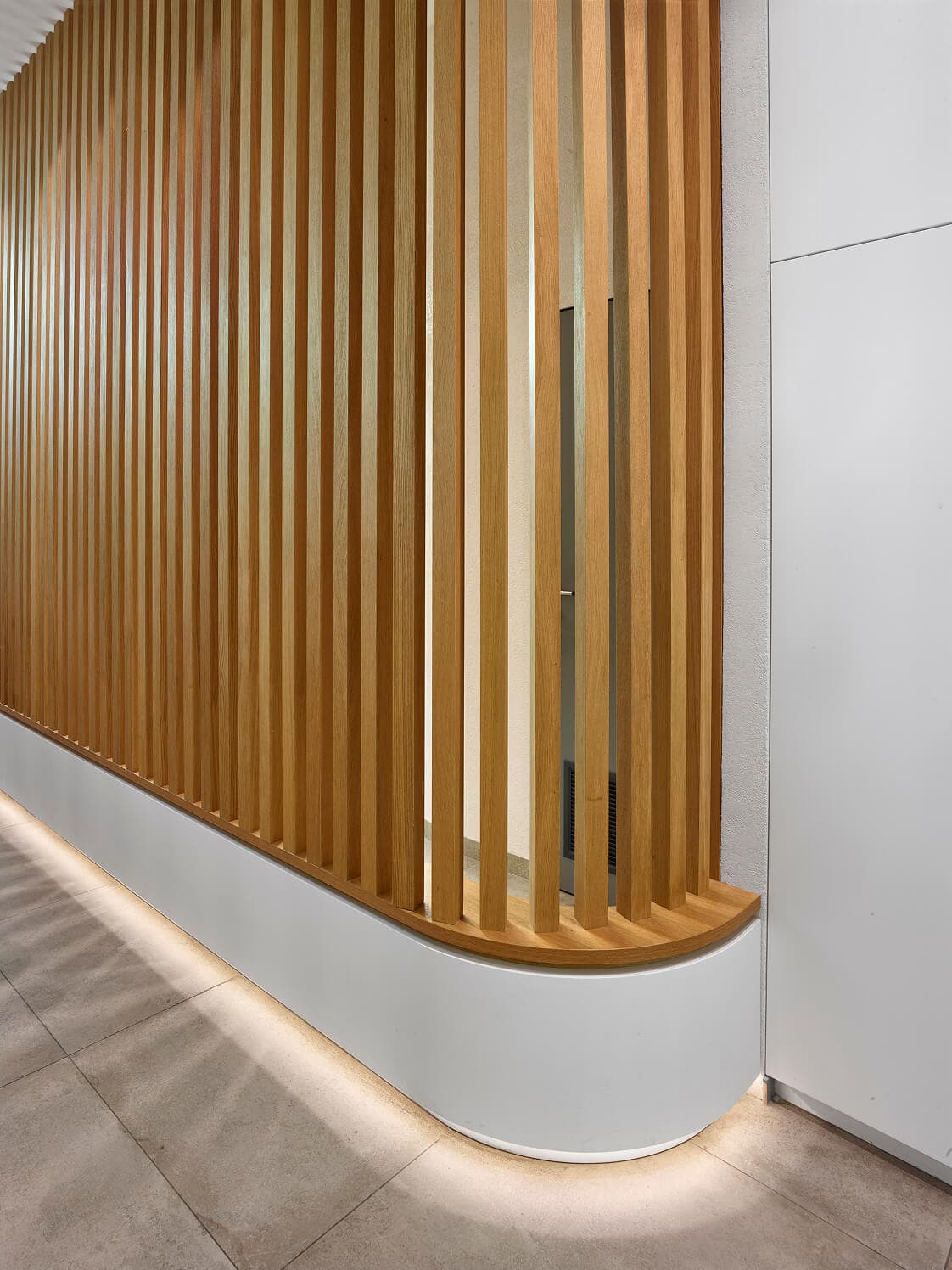
Rounded edges evoke a sense of warmth and safety. They are reflected in the floor plan of the spaces, the chosen furniture, and even in the details, such as the trim on the dividing partitions.
/Branch
Chodov
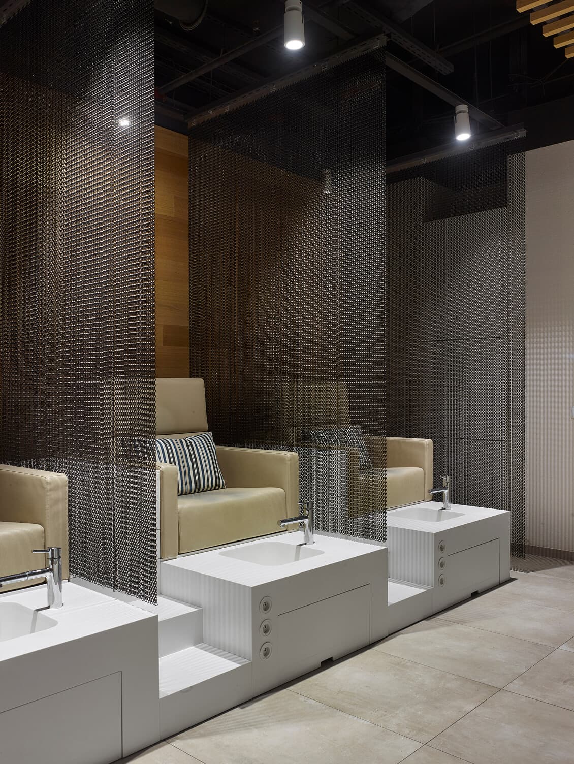
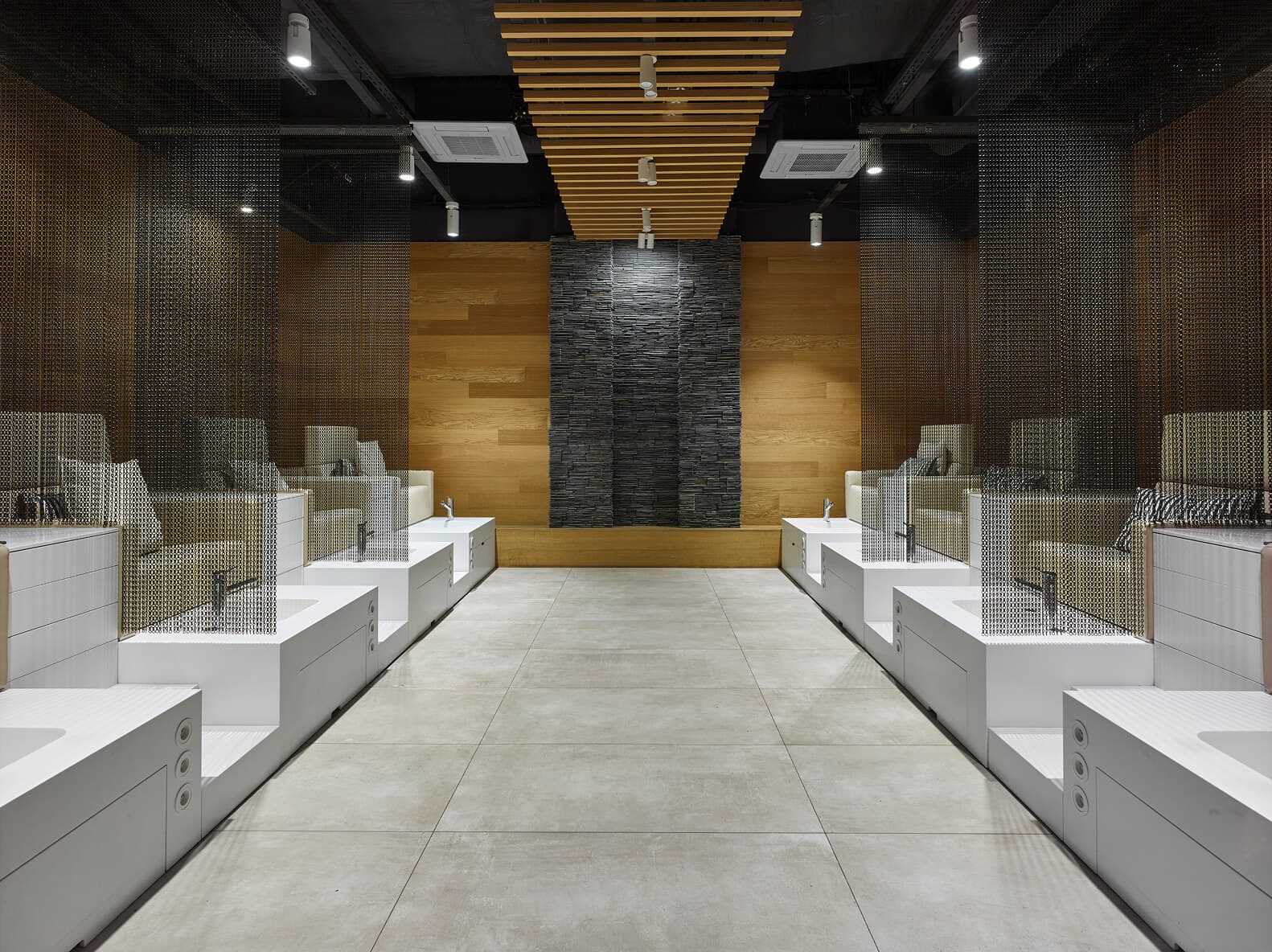
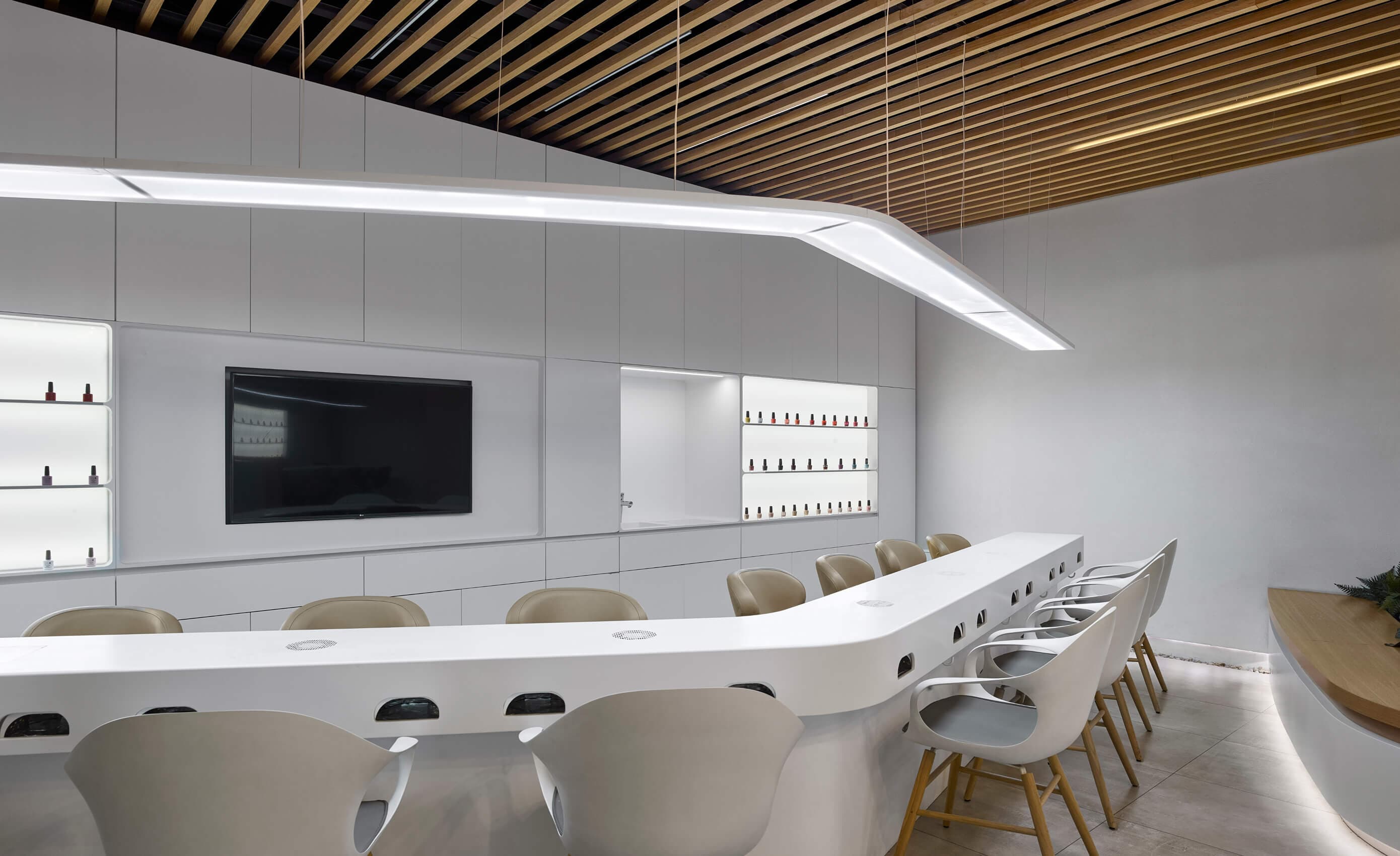
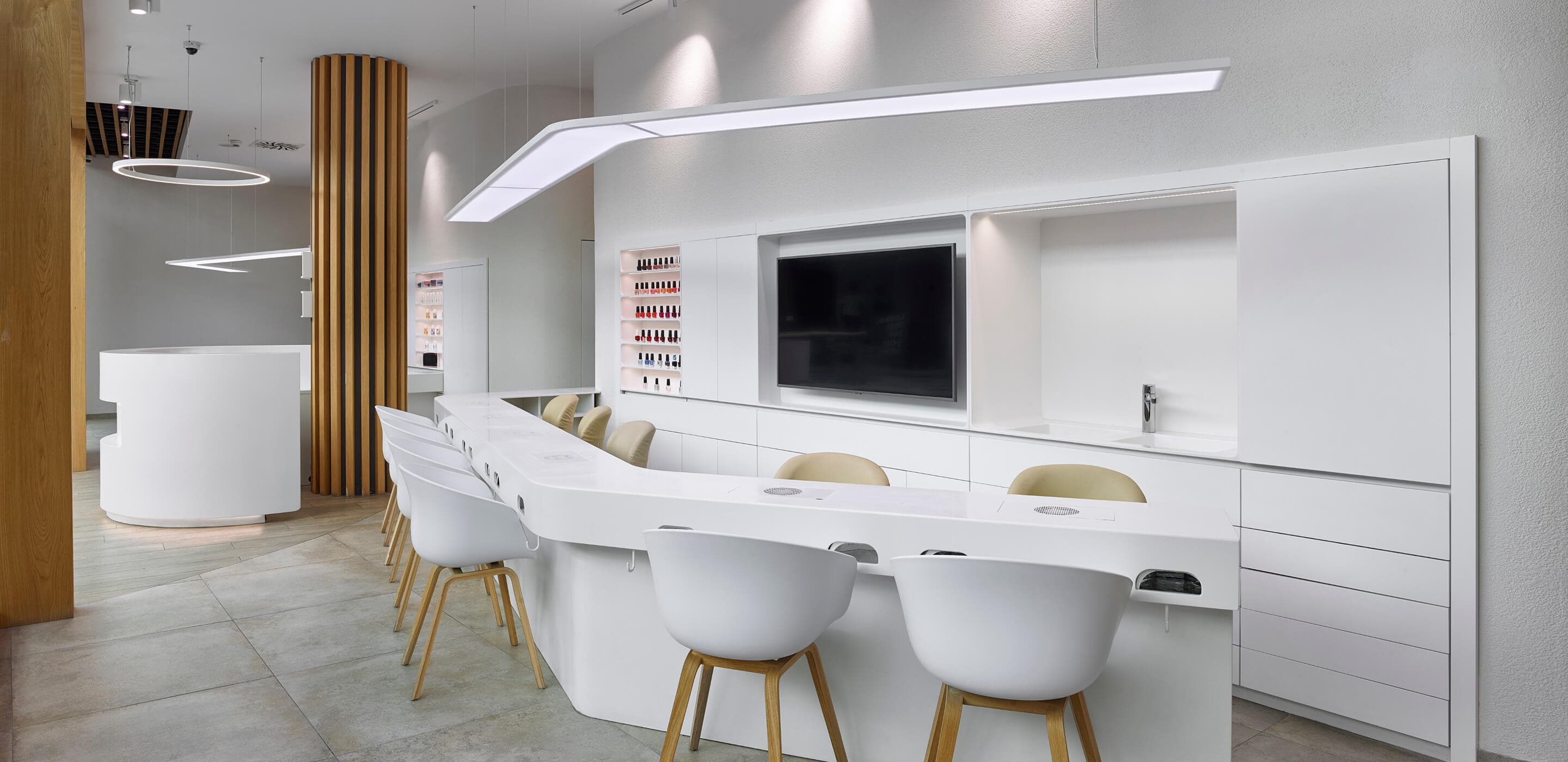
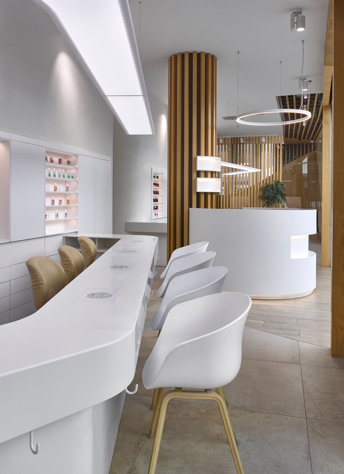
In the center of the space is a circular reception, from which pathways lead to the individual treatments. The radial direction is reflected in the choice of lighting above the reception. The distinctive character is defined by the bold division between the cubicles: partitions made of delicately shaped aluminum create striking visual layers. The unique aesthetic of the wooden slats is incorporated into the ceiling design, allowing for subtle interaction with light and ventilation.
Accent
The usual white color and wood texture are complemented by a metallic touch: aluminum curtains and dark stone cladd.
/Branch
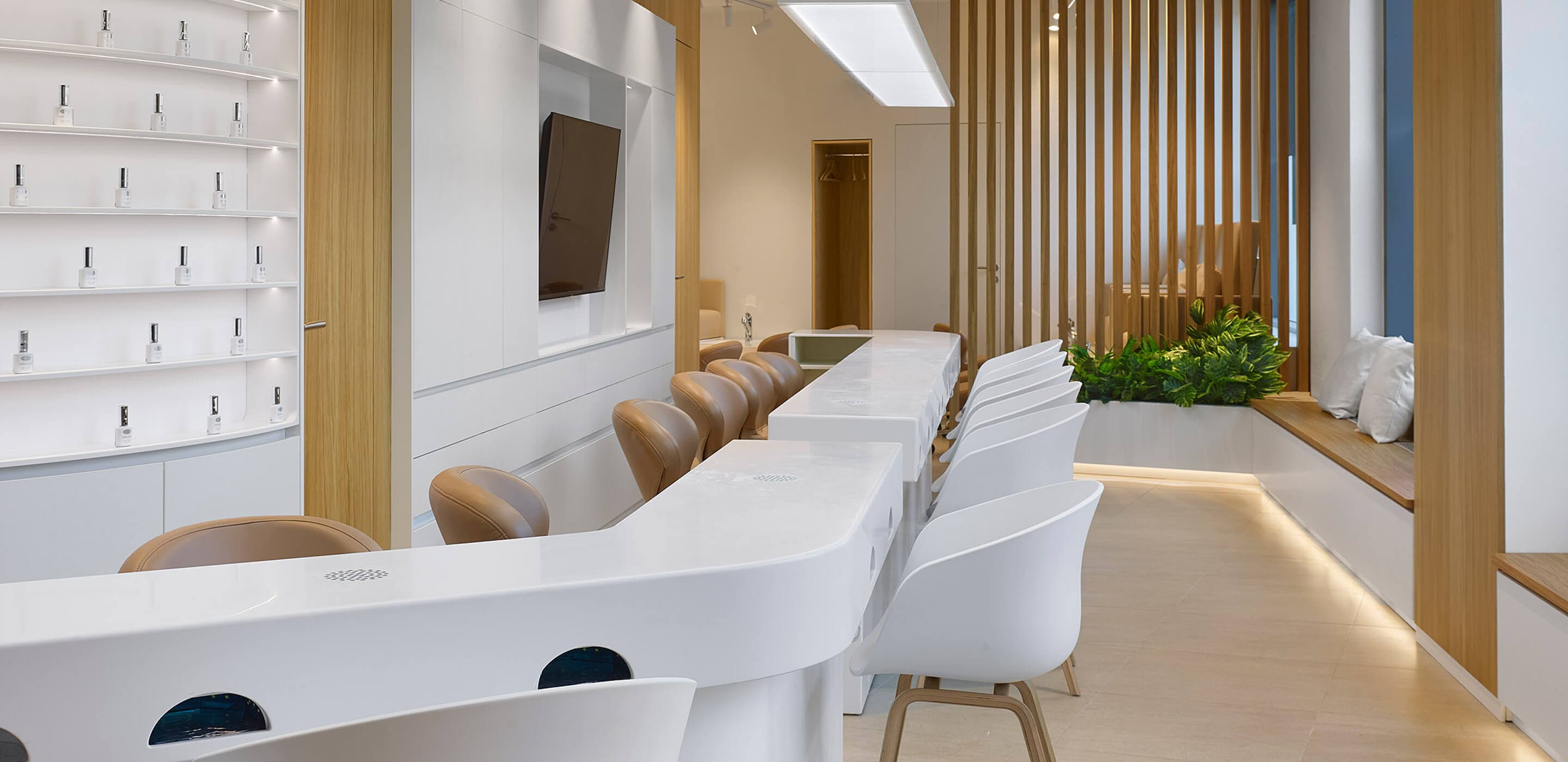
Vaňkovka
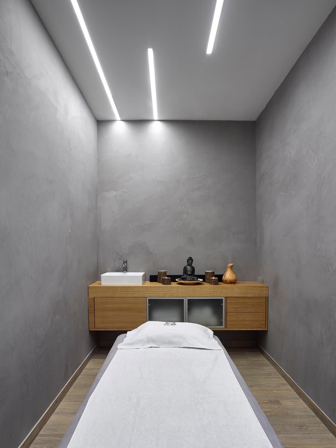
The natural material’s color and texture are complemented by white, which brightens the interior while ensuring a sense of cleanliness and clarity. For more intimate treatments, a semi-enclosed area behind a visual partition offers privacy without fully closing off the space.In Vaňkovka, the rounded shapes of the furniture and fixtures are highlighted by a striking circular light, while green plants bring vibrancy and a sense of calm to the interior.
Light
The light ramp above the treatment area follows the shape of the work surface. The chosen light hue does not distort but rather highlights the colors of the cosmetic products.


/Branch
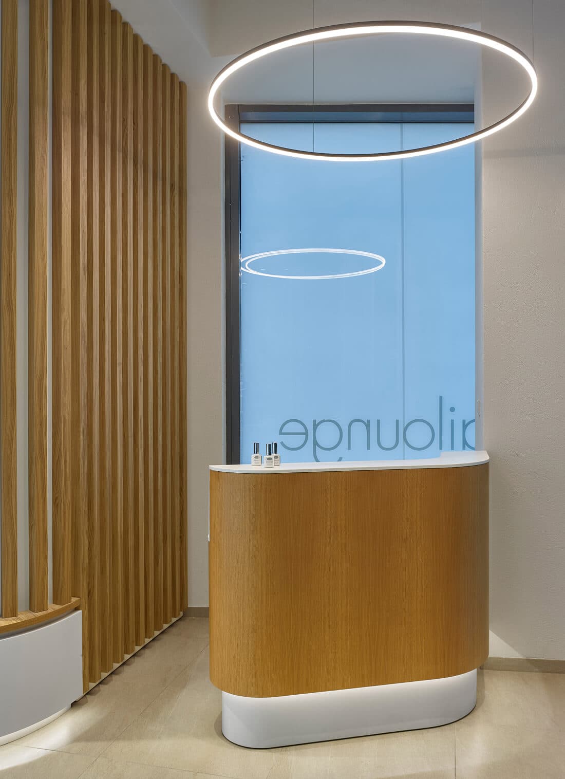
Letňany
The limited space of the establishment invited a creative approach. The circular reception desk appears to dance around the adjacent column, while the curved light ramp and circular fixture amplify the sense of fluidity and motion. Its wooden slatted base forms a gentle light niche, anchoring the composition. Despite the full-length window display along the façade, the space maintains a surprising sense of intimacy.
Atmosphere
The carefully chosen lighting creates the impression of optical space enlargement. Beams passing through the partition slats create a soft effect.
Branches
All branches maintain a consistent design, yet each differs slightly: in window size, plant placement, or the curvature of the partition.
/Praha
OC Černý Most, OC Letňany, Metropole Zličín, OC Quadrio
/Most
Central Most
/Hradec Králové
Aupark Hradec Králové
/Brno
OC Vaňkovka, OC Olympia
/Kladno
Central Kladno
/České Budějovice
IGY České Budějovice
/Olomouc
OC Olympia Olomouc
/Bratislava
Aupark Bratislava
Project Team
Logo
Daniel Simonini
Graphic Design
Sara Satie Yamame
Architecture
Vera Hampl, Thiago Cataldo, Stanislav Lenert, Jan Laurich
Photography
Filip Šlapal
Organization
Zdenka Terenc